Defining 5&5’s Digital Identity
Establishing a Strong Brand and a Seamless User Experience
ROLE
Lead UI/UX Designer
DESIGN DURATION
6 Weeks
READ TIME
8 minutes
Project Overview
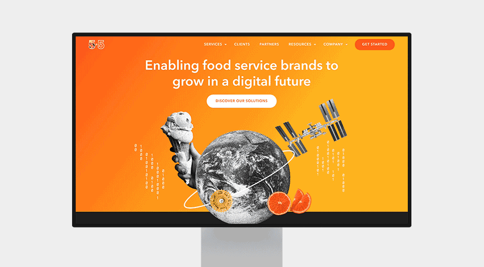
5&5 is a leader in digital solutions for the food service industry, but its outdated website failed to showcase its expertise. Without a clear brand identity or intuitive user experience, potential clients struggled to understand its offerings. This redesign wasn’t just an upgrade, it was a transformation, creating a bold digital presence that reflects 5&5’s innovation and authority.
Chapter 1:
We Have a Problem
5&5’s website lacked a clear brand identity, making it feel disjointed and forgettable. Poor navigation, unclear messaging, and outdated design created barriers for potential clients instead of reinforcing its industry authority.
The goal was to transform 5&5’s digital presence with a strong brand identity and seamless user experience. I crafted a design that improved navigation, accessibility, and recognition.

Chapter 2:
The Research
We conducted a competitor analysis, audited the site, and gathered user feedback, comparing it to leaders like Olo, ChowNow, and Toast. This research highlighted key issues impacting the user experience and brand perception, guiding our redesign strategy with a focus on navigation, branding, and accessibility.
Question 1
Why did users struggle to find key pages, clicking endlessly just to complete a simple task?
Question 2
How could we rebuild trust when the brand felt disconnected and inconsistent?
Question 3
What was stopping users from having a seamless experience, especially on mobile?


Chapter 3:
Defined 5&5’s Brand Identity
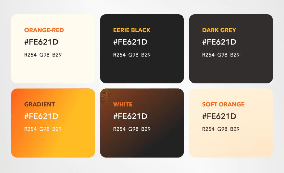
Established brand guidelines with typography, color schemes, and design elements that set the tone for all digital touchpoints.

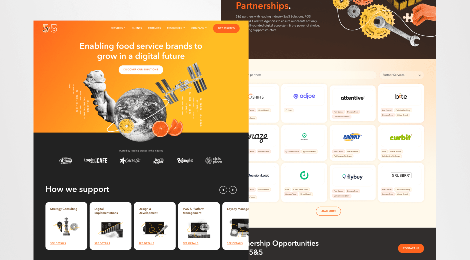
Revamped Site Architecture
Simplified navigation, making content more accessible and digestible.

Modernized UI/UX Design
Introduced a sleek, modern layout that feels intuitive and engaging.
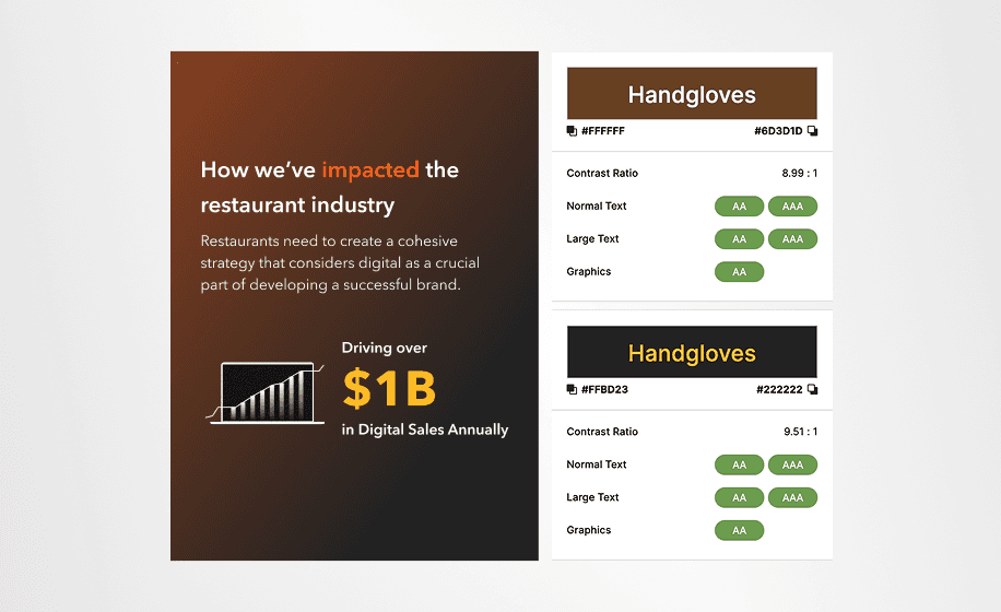
Optimized Accessibility & Performance
Improved readability, contrast, and mobile responsiveness.
Chapter 4:
Collaboration & Challenges
During the beta launch, we discovered a major issue, users were struggled to navigate the homepage, making it difficult to find key information. Working closely with developers and project managers, we refined the navigation with clearer labels, improved visual hierarchy, and adjusted the layout for a smoother experience. To further improve clarity, we created a dedicated services page, helping new clients quickly locate their options. These changes made the site more intuitive and user-friendly.
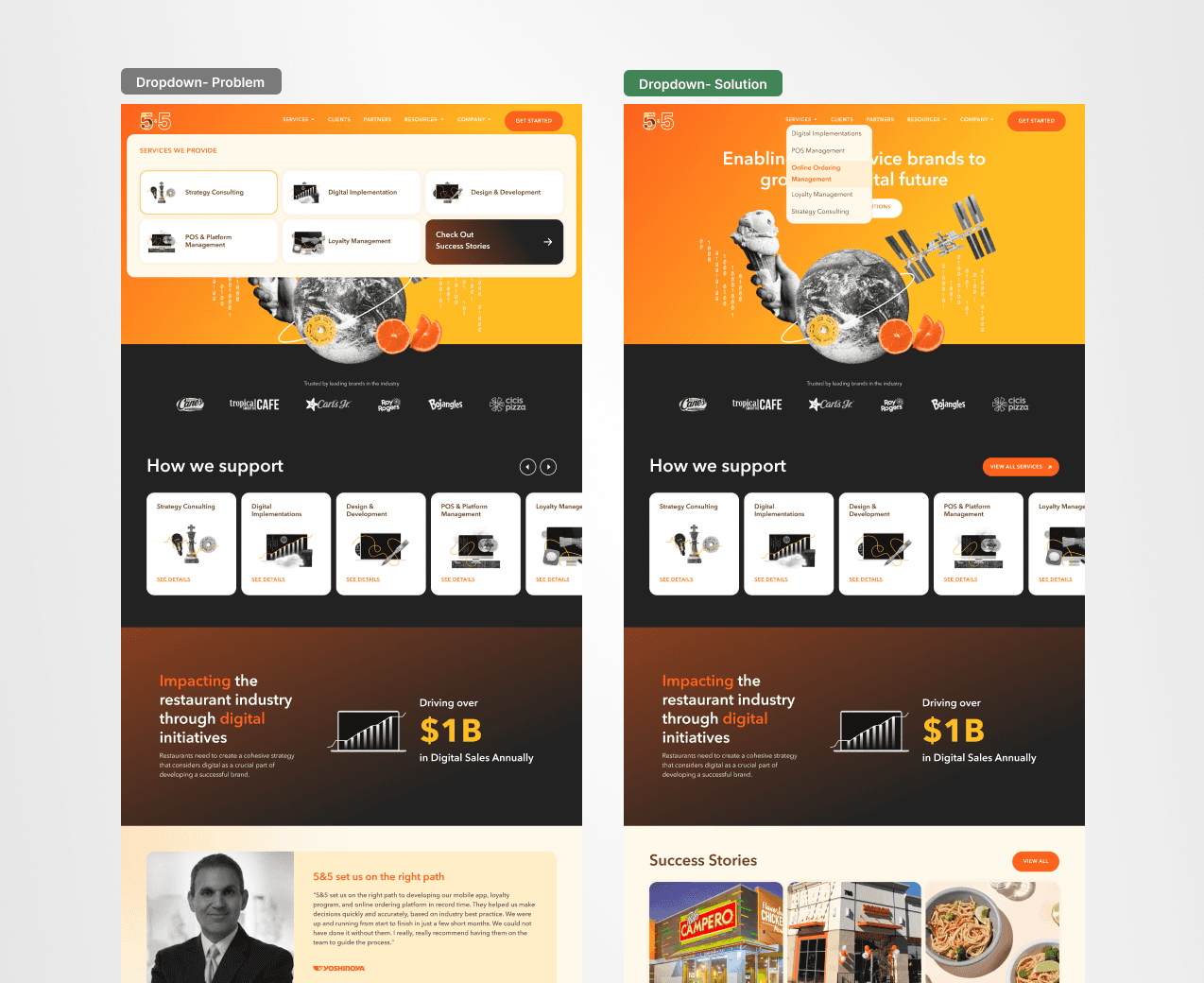
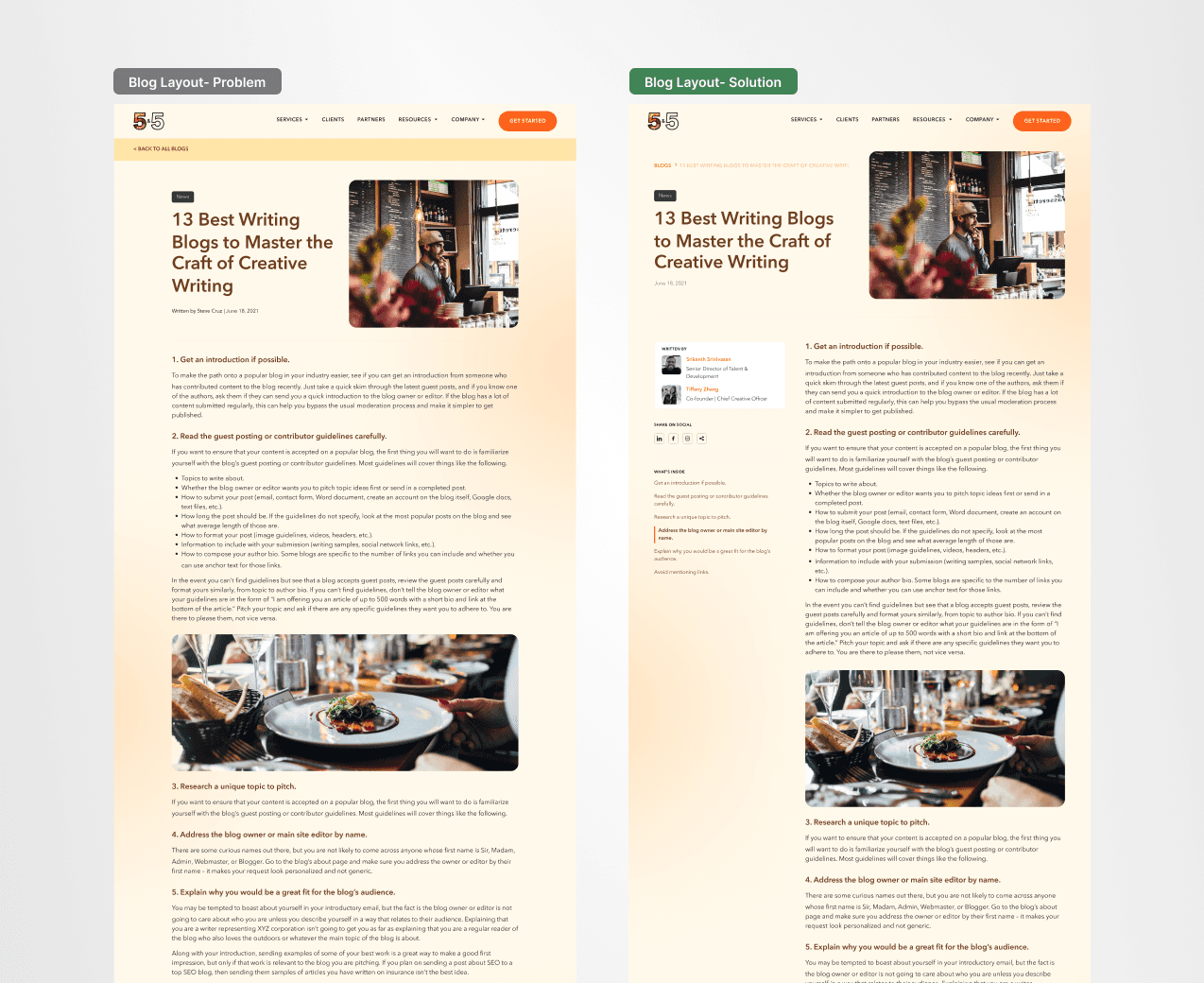
Our goal was clear, remove frustration and make navigation effortless. Before the redesign, users struggled to find key pages, branding felt inconsistent, and accessibility issues created barriers. By refining navigation, strengthening brand cohesion, and improving accessibility, we transformed confusion into clarity. The result? A seamless, user-friendly experience that made finding information effortless.